Creative professionals lose up to 40% of their billable week to "Tool Fatigue"—jumping between specialized apps for file sharing (Dropbox), communication (Slack), feedback (Figma), and billing (FreshBooks).

Objective
Dezynsync entered the market to eliminate this structural friction. The objective was to build a cohesive visual identity and digital presence for a high-utility SaaS platform that unifies asset synchronization, client collaboration, and automated financial settlements.
The Challenge
The challenge was positioning a complex "4-in-1" feature set as a clean, effortless, and premium ecosystem that creative directors and elite freelancers would instantly trust.
The "Anti-Chaos" Principle
Before touching a vector grid, we defined the brand’s core positioning statement: The Single Source of Truth for Creative Execution. We shifted the narrative away from mundane task management toward creative empowerment.

The Villain
The "Amateur" workflow (expired links, lost feedback, manual chasing).
The Hero
The "Professional Standard" (systemized automation).
The Tone
Invisible, high-contrast, technical, and confident.
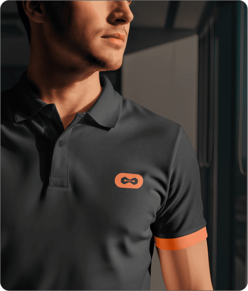
The Logo: "Node-Bridge" Concept
For a product built on continuous alignment, the visual mark needed to represent precision. I designed a custom geometric glyph combining the Vector Anchor Point (Pen Tool) with a Hardware Port.
The Geometry
Sharp, 60-degree hexagonal nodes paired against a perfectly radiused capsule container. This created an intentional tension between technical utility and fluid accessibility.
Scalability
The inner connector line was micro-adjusted to maintain perfect legibility at a 16x16 pixel favicon scale, while holding substantial visual weight when scaled to large environmental banners.
The Color System: Industrial Productivity
We avoided standard "creative suite" neon gradients to establish immediate market differentiation.
Primary Obsidian
#141413A deep, low-glare dark mode base favored by designers working long hours.
Accent Amber
#F37338A high-visibility, action-oriented orange that signals speed, utility, and systematic clarity.
"You were hired to design, not to act as a file librarian."
Using a strict geometric sans-serif grid, the campaign stripped away visual clutter to mimic the platform’s core benefit: Zero Friction.
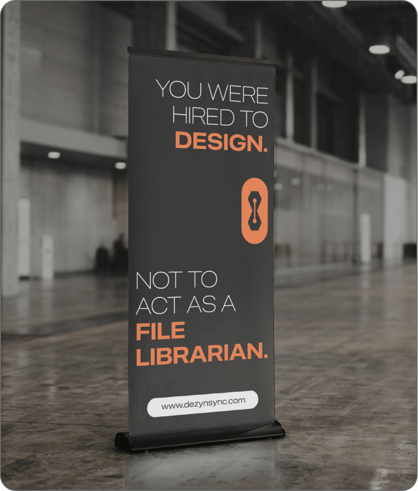
The Process Grid — The 8 Pillars
Activating "GodMode"
SYSTEM_STATUS // GODMODE_ACTIVE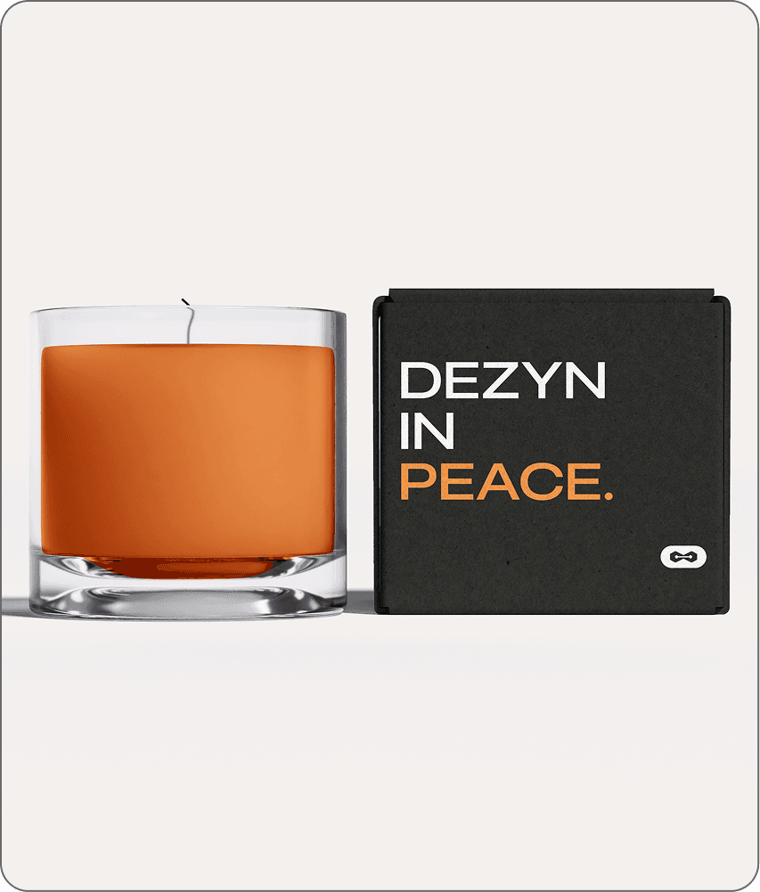
The Concept
A dedicated dashboard environment where the user’s local folders, real-time client chat loops, and milestone-triggered invoices operate in perfect automation.
Micro-Interactions
When the system achieves complete cloud-to-local symmetry, the dashboard interface subtly reveals an active state: SYSTEM_STATUS // GODMODE_ACTIVE in a monospaced terminal font, rewarding the user with a feeling of absolute control over their business.
"This project required balancing a highly functional utility tool with an aspirational creative brand. By establishing a rigid design system rooted in utility rather than trends, dezynsync successfully launched its beta platform with a distinct, premium voice that speaks to the elite tier of the creative economy."