E-commerce sellers routinely split their business across separate agencies for Amazon management, Shopify builds, ad creative and product imagery, and every handoff between them leaks strategy, time and margin.
Objective
SellerVolt was founded to replace that patchwork with a single partner. The objective was to take the business from a name to a launched brand: strategy, identity, and a website that sells the full service stack with confidence.
The Challenge
The challenge was making six very different services, from wholesale sourcing to photorealistic 3D renders, read as one coherent, high-energy brand rather than a scattered list of offerings.
The "High-Voltage" Principle
The positioning was built around one idea: energy transferred into growth. Every line of copy and every visual decision answers the brand promise "We Power Success", framing SellerVolt as the power source behind a seller's entire operation.
The Villain
Juggling multiple providers: misaligned agencies, diluted strategy and lost accountability.
The Hero
The one-stop advantage: one strategist, one plan, every channel.
The Tone
Charged, direct and results-led, with bold claims backed by numbers.
The Logo: "Live Wire" Concept
The wordmark carries the concept on its own: the E in SELLER is replaced with a lightning bolt, turning the name into the brand promise. SELLER is set heavy and solid, VOLT light and outlined, so the mark reads as the seller and the power behind them.
The Bolt
The lightning glyph works as a standalone icon for favicons, social avatars and UI accents, and anchors the animated orbit at the centre of the website hero.
The Typography
A tall, condensed display face gives headlines an industrial, high-velocity feel, balanced by DM Sans for clean, readable body copy.
The Color System: Charged Contrast
A dark, grid-textured base lets two energy colours do the talking: a warm orange charge and a cool electric blue, echoing positive and negative poles.
Volt Orange
#FC9E4FThe primary charge, used for calls to action, highlights and the bolt itself.
Grid Charcoal
#1E1E1EA deep, low-glare base that makes the energy colours glow.
Spark Cream
#FFF9F4A warm off-white for type, softer than pure white on dark surfaces.
Electric Blue
#22D3EEThe cool counter-charge, used in gradients and to balance the orange.
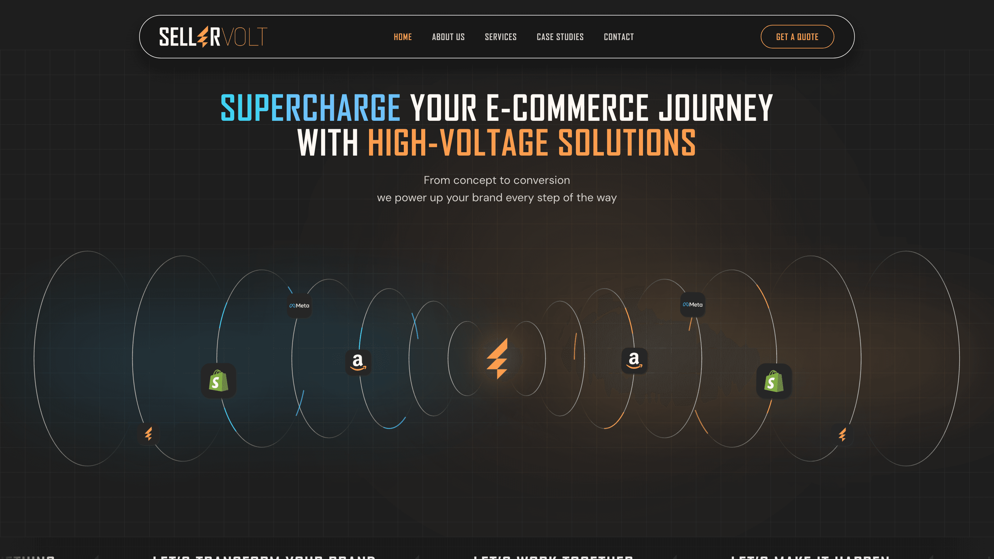
"Supercharge your e-commerce journey with high-voltage solutions."
The service architecture was distilled into six capabilities, each framed around a measurable outcome so the breadth of the offer reads as strength, not sprawl.
The Service Grid — The 6 Capabilities
Designing the Power Grid
SYSTEM_STATUS // FULLY_CHARGEDThe Hero
An animated orbit of platform icons (Amazon, Shopify, Meta) circles the central bolt, showing every channel powered from one source before the visitor reads a word.
Proof-Led Flow
The page moves from promise to proof: animated stat counters, a featured success story with a drag-to-compare before and after slider, and verified client reviews, ending in a single clear call to book a discovery call.
"SellerVolt went from a name to a live brand with one consistent voice, carried from the logo through to every interaction on the website. Designing and building it end to end meant the high-energy identity survived the handoff to code intact."